

Our Homepages, Ourselves
Why are fashion brands obsessed with "newness", and what's the alternative?

Why read this?
Get to the root of fashion eCommerce’s obsession with “newness” and generate some alternative ideas for how to use your homepage.
Learn how to question “best practices” and jailbreak your mind to enable new, needle-moving ideas that are still grounded in reality.
I’ve been looking at a lot of homepages lately—both because I love to shop, and because it’s my job. I couldn’t help but wonder: why do apparel, footwear and accessories brands consistently focus on “newness”?

Clockwise from top left: DVF, Loveshackfancy, Ulla Johnson, Veronica Beard
Take a look at these homepages from well-known contemporary fashion brands. They’re either promoting new arrivals or new promotions.
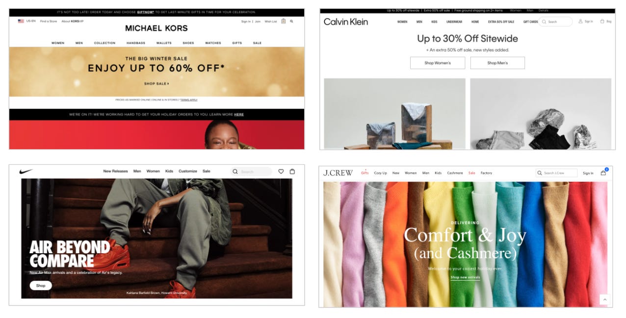
Clockwise from top left: Michael Kors, Calvin Klein, Nike, J. Crew
We see the same thing for large “lifestyle” brands that have more of an established retail store network—nothing but newness.
Whenever something appears to be unchallenged conventional wisdom or “best practices”, that’s a great signal to dig in deeper and ask “why”?
The truth is, a lot of “best practices” are simply something that worked for someone five years ago that has never been probed or challenged, even though the instigator has long since moved on.
Real talk though: if you’re like me, you probably have a lot going on. Now I’m asking you to “think different” about your homepage?! How do we even start?
I’ll walk through a simple three part framework for jailbreaking your mind from “best practices” mode, thinking more critically about why we do what we do, and generating some fresh, meaningful ideas to test out.
Step 1: Study Brands Wayyyy Outside Your Competitive Set
Let’s give our brain a palate cleanser and re-orient ourselves into an objective observer mindset by studying some brands completely outside the mainstream fashion/footwear/accessories universe.
Knowledge Products

Clockwise from top left: The Renegade Diet, Ed Latimore, IWT, Dennis Demori
Knowledge products include online courses, e-books, coaching and other paywalled sources of expertise.
Popular themes include improving physical fitness aka getting swole, growing and monetizing a social media following and, yes, creating and selling your own knowledge products.
The people who create these products give out a lot of free advice (it’s part of the strategy), so it is easy for me to outline some of the guiding principles behind these homepages/landing pages:
Copy is the most important thing. These pages often contain 1000+ words of copy outlining the problem and the solution, with multiple CTAs as you scroll down the page.
Design matters too, but it is a tool to enhance usability and create a sense of legitimacy.
You’re selling a solution to a problem, not a product. The best pages tap into the raw frustration of the prospect.
The result is something completely outside the fashion wheelhouse. It works because you’re not selling something physical, you’re selling a solution packaged into some cloud-based media format.
Privately Owned* Luxury Brands

Clockwise from top left: Comme des Garcons, Thom Browne, Marine Serre, The Row
Next, let’s look at the websites of brands who answer to no PE firm, parent company or nebulous cloud of mutual fund managers.
*I know that Thom Browne is now owned by the Zegna group, but their site hasn’t changed much since the acquisition.
Luxury brands, by their nature, need to create an experience that addresses all five senses that provides a framework of perfection that still leaves room for serendipity.
In the world of physical goods, that usually translates into one craftsperson + one artist + the principles of hospitality.
In the digital world, these brands generally lack a skilled digital craftsperson, so the efforts are stranded in a kind of purgatory where physical luxury principles are applied to digital experiences.
That makes these websites interesting artifacts of a transitional time, so we should study them. Here are some observations:
The homepage here is trying to be an emotional experience, not a commercial one. In most of these examples, product taxonomy is hidden. CdG doesn’t even have eCom on their site.
The lack of commercial context implies that the visitor knows what the brand is about--these sites make no effort to explain themselves.
This emotional experience is typically presented through arresting imagery or video content.
The “hospitality” element is missing, because the decision-makers don’t understand the rules of hospitality on the web. Auto-play audio and long load times are a no-no.
The result is anti-commercial, but does sometimes succeed in provoking strong feelings, even if some of those feelings are frustration.
Direct to Consumer Brands

Clockwise from top left: Jambys, Haus, Hims, Quip
Finally, let’s look at the bugaboo of traditional retailers everywhere—direct to consumer brands. These brands have their own set of “best practices”:
The homepage eschews newness entirely, which is sometimes a result of the fact that these brands are young and only have a few evergreen SKUs.
There are typically one or two lines of snappy copy outlining the brand’s value proposition—aka “why we exist”.
Imagery supports the copy and/or shows the product in context. It’s all about providing the most information per square inch.
The Jambys homepage shows the starkest contrast between the DTC playbook and the traditional retail playbook. Jambys is a multi-SKU pajama and loungewear brand, but their homepage features a small image of a single SKU and copy dominates.
Would a “traditional” retail brand ever do that?
Because these are young-ish direct to consumer brands, the website needs to serve multiple purposes: create demand, capture demand, and answer questions from potential customers with various levels of familiarity about the product.
In this context, the homepage strategy we’ve observed makes sense. Most of your homepage traffic is coming from two places: (1) people who heard about the brand from somewhere and want to learn more, and (2) people with high-ish familiarity and purchase intent who are kicking off the path to purchase.
#2 probably knows where they’re going, but the copy and context don’t de-motivate them in any way. On the other hand, providing a direct marketing-influenced “brand 101” on the homepage for #1 is going to help you vet and convert potential leads.
Step 2: Apply The Same Principles To Your Own Best Practices
Now that we’ve done a few reps of objective analysis, let’s try to look at fashion/footwear/retail homepages with the same set of eyes.
What does the focus on “newness” imply about the people we are speaking to via the homepage?
Would someone who has never heard of a brand before care that new product has arrived? Probably not.
So speaking to newness is speaking to a returning customer, or at least to a warm prospect who has a rough idea of what the brand is about. Newness doesn’t answer any questions about “why this brand?”
When you think about the distribution strategies of these brands, this approach makes sense. The assumption here is that most web visitors have had a physical experience with the brand before visiting the website.
They found it in a local boutique, or popped in a store while on a visit to the local outlet mall. Even if the brand doesn’t have a distinct mission statement or raison d'etre, the web visitor liked the merchandise enough to seek out the website for further investigation.
In the era of declining mall traffic and Covid-driven store closures and changes to consumer behavior, it’s worth questioning if this homepage strategy is still the best one. Which brings us to…
Step 3: Exercise To Get Your Creative Juices Flowing
I’ve observed two major challenges in generating ideas that are different enough yet informed enough to “move the needle”. The first is a lack of first principles understanding, which we just covered in steps 1 & 2. The second is “getting loose”.
In visual art, you’ll typically need to spend 20-30 minutes warming up using various drills before you are in a mental and physical state to produce decent work.
In brainstorming, it’s often best to collect a brain dump of ridiculous stuff to create a “circle of trust”, then send each member of the group off to study and draw their own, more refined conclusions.
To get that brain dump going, here are some thought starters to work on with your marketing, digital merchandising and UX teams. Or, if you’re a founder, yourself.
Borrowing From Knowledge Products
Imagine a situation where you needed to sell your product online without ANY images. What features of the product would be critical to describe? How would you convey the value or benefit of the product? How would this change the way you structured and prioritized elements on your homepage?
Try redesigning the homepage or the product detail page with NO images. Do you develop any new elements that could be repurposed on your current site experience?
Borrowing From Privately Owned Luxury Brands
What if your goal was to create an intense, memorable emotional reaction for your website visitors, instead of winning a sale? What emotion(s) would you want consumers to associate with your brand? How would you use the five senses to elicit this emotion?
Round up a few coworkers. Have each one choose an emotion, write it on a piece of paper, and hide it for later. Try to design a homepage experience for your brand that elicits your emotion. Share with the group and see if other members can guess your emotion. The winner(s) should get a prize.
Borrowing From DTC Brands
Grab a pen and paper, and then go on to Instagram and start clicking on ads for brands you have never heard of before, but make sure you find the brand interesting.
Take notes as you navigate through: Why did you find the brand interesting? What questions did you have as you clicked through the ad/were you looking for certain information? What was the landing page of the ad? Did it answer your questions? Where were you compelled to go next?
Now audit your own website/customer journey with these questions in mind. Is there anything you would add or remove from your current experience after this exercise?
That’s all for now. I hope this post gave you some fresh ideas to kick off the new year, and helped you second guess “best practices”. If you found this helpful, reply and let me know :)
Why Don’t You…
Because this section was popular in my last newsletter, here is a list of things to read, watch, listen to, purchase (no affiliate links).
…Give yourself over to a charming but unlikable narrator. This book is like stereotypical French guy x RETVRN meme x Martin Amis at his best…that is the best I can do to describe it. Also (fair warning) very inappropriate and decidedly not woke.
…See yourself through the eyes of another. Hallmark Christmas Movies reveal how mainstream America views the costal elite, IMO. Come to think of it, this is the saccharine compliment to recommendation #1. Farmers rise up!
…Develop an opinion about the spaces we live in. If you have started to wonder why architecture has become so politicized, these two pieces will give you both sides of the issue.
…Spice up that towel rack. It’s the little things.